Mohon Maaf, Saat Ini Akun Anda Kena Suspend!
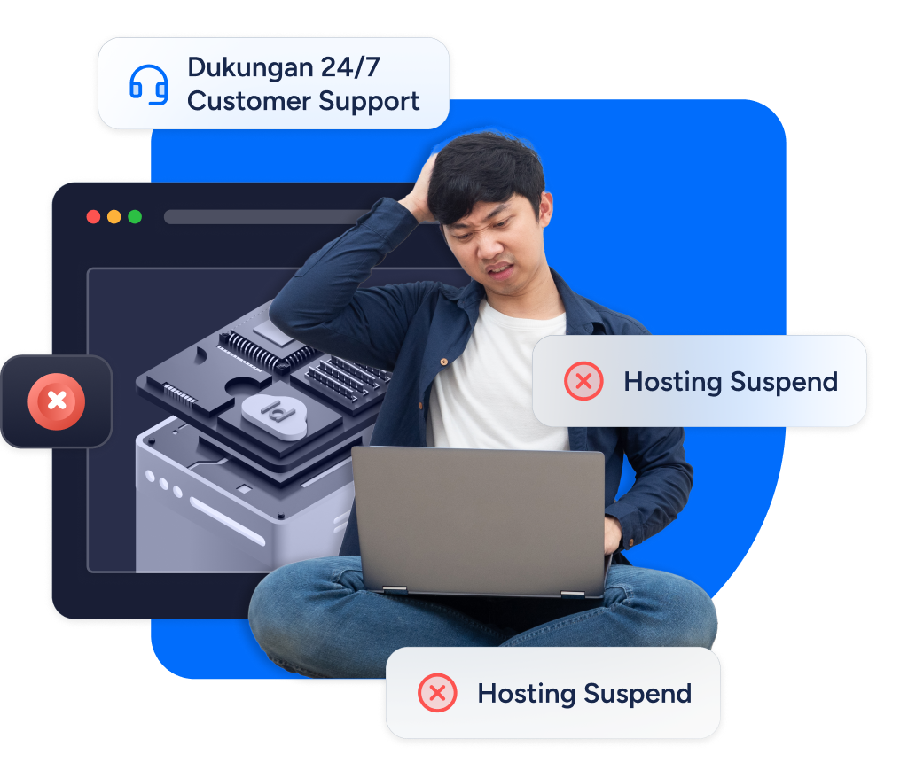
Kepada pelanggan setia IDCloudHost, layanan hosting Anda dihentikan untuk sementara waktu. Kami mohon maaf atas ketidaknyamanan ini. Jika Anda ingin layanan dapat kembali beroperasi dengan lancar. Anda bisa pelajari lebih lanjut disini : Cara Mengatasi Website yang Terkena Suspend
Rekomendasi Layanan IDCloudHost Untuk Anda